Went to Kew Gardens this weekend for Flora Japonica exhibition. A friend of mine kindly booked my place for the exhibition tour by co-curator Masumi Yamanaka.
The exhibition was at the Shirley Sherwood Gallery of Botanical Art.
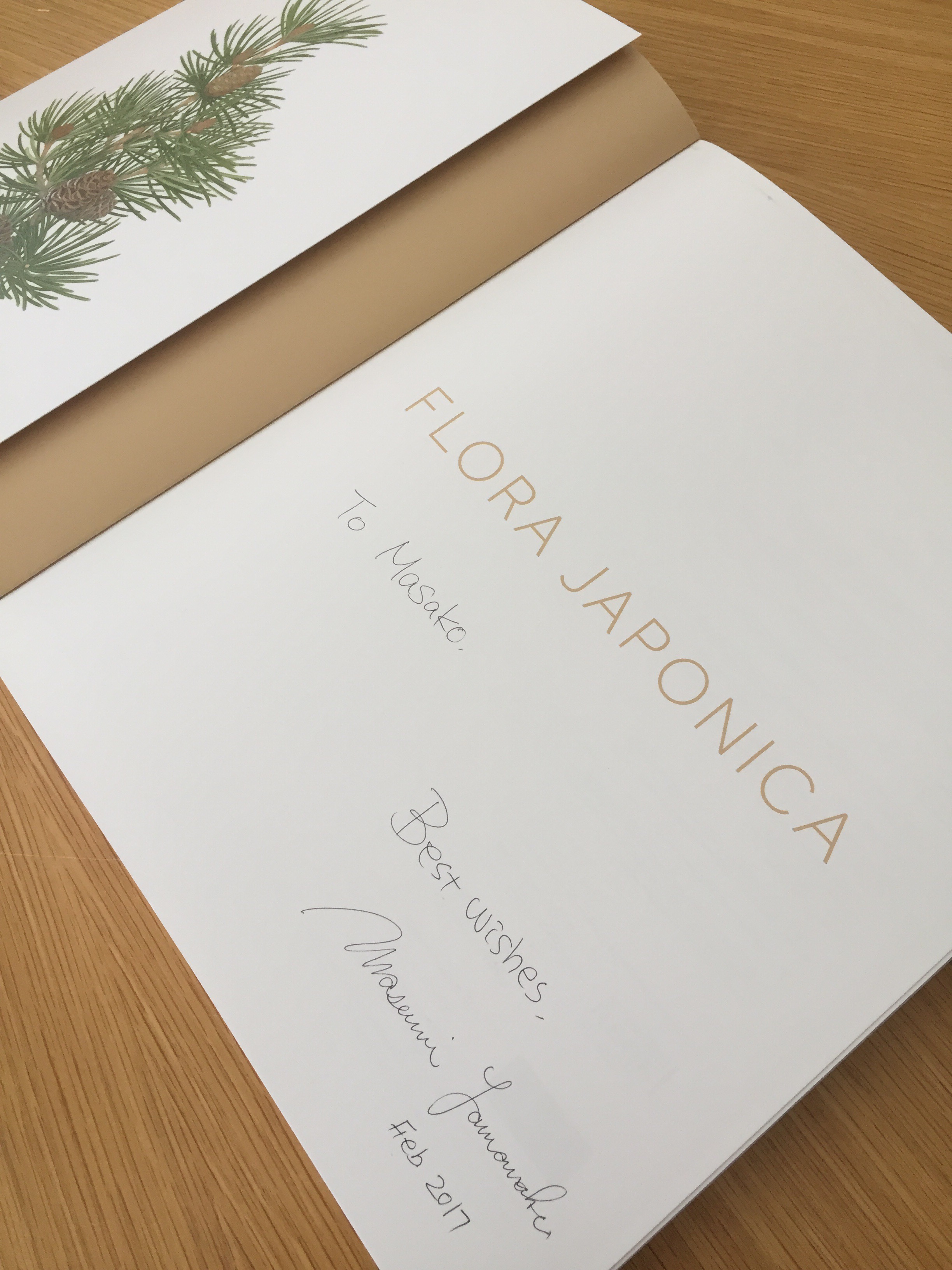
Masumi’s talk was very informative. I always wondered what the differences were among floral painting, botanical art, botanical illustration, and scientific illustration. I’m glad to purchase the book that goes with this exhibition. This will give me a lot of inspiration for my embroidery work.
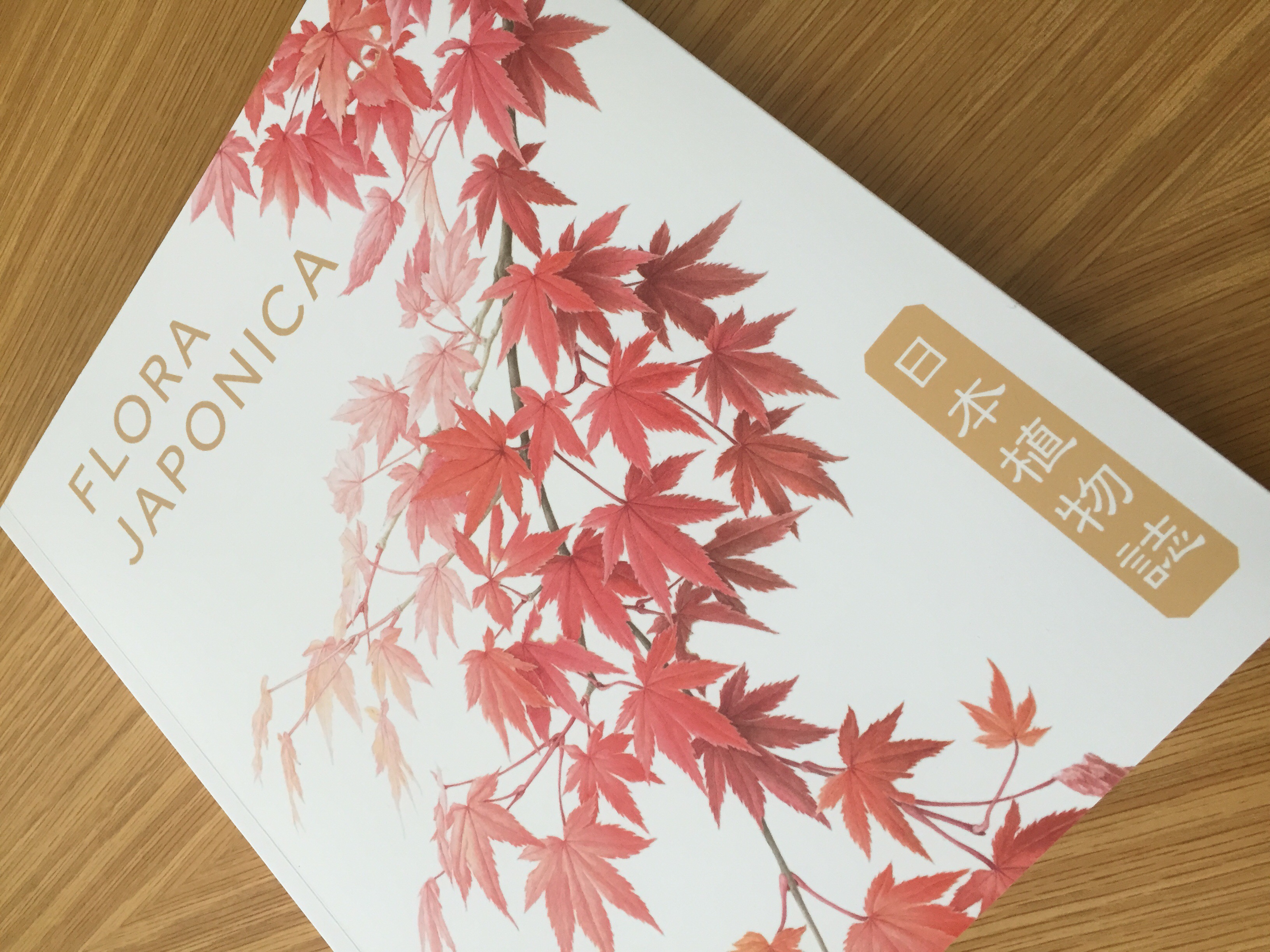
One particular thing from Masumi’s talk struck me. She said that Japanese botanical artists tend to use some empty spaces in the composition. This front cover of the book is a good example. (This excellent botanical illustration is by Kyoko Ohara.) You can tell there are some empty spaces. (Well, book title fits on the page thanks to those spaces!)
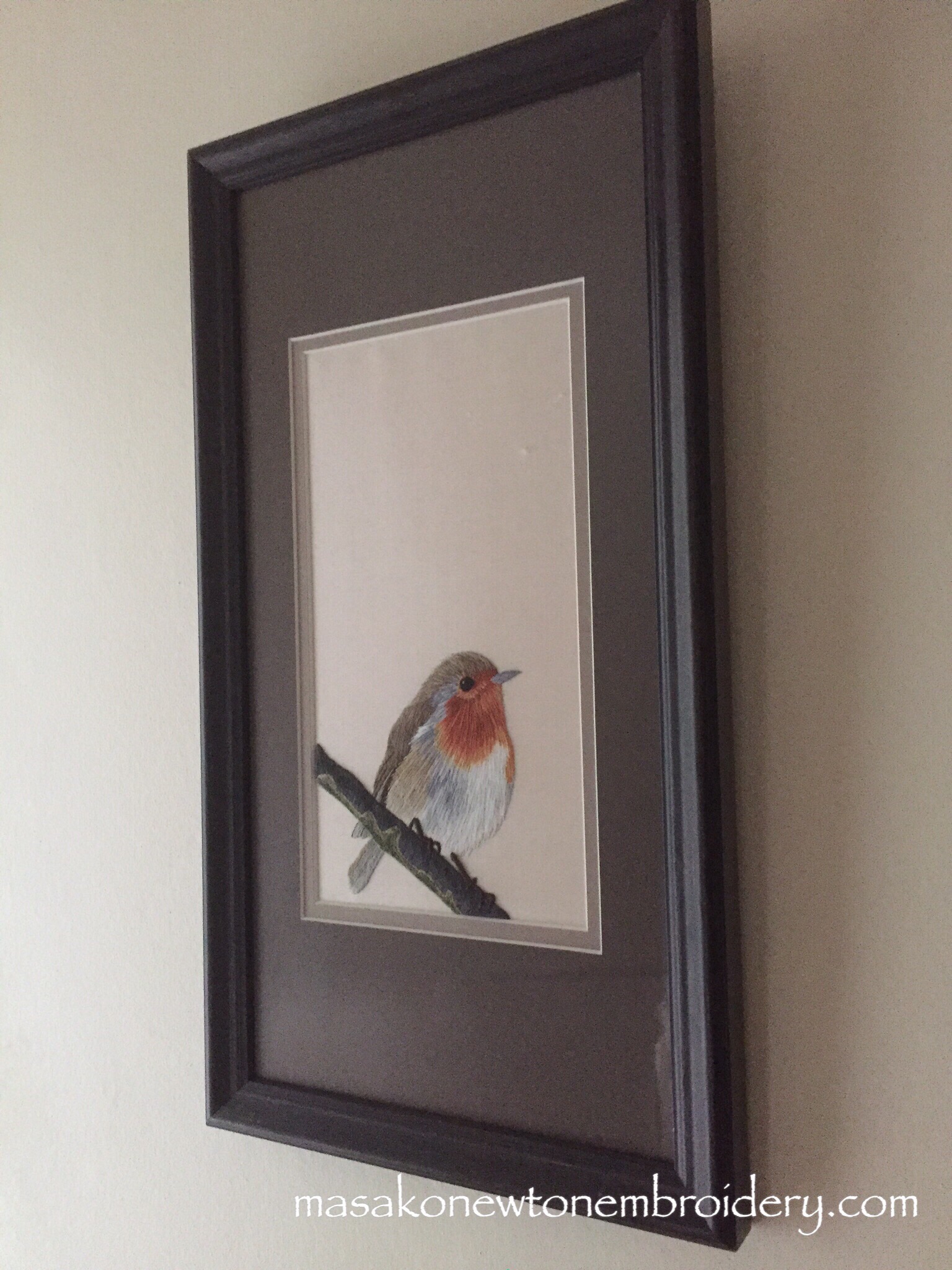
When I embroidered a robin on a branch for my silk shading work a few years ago, I wanted to use some empty spaces when mounting. I wanted my work to look like a Japanese hanging scroll. My tutor told me to explain why I deliberately used some empty space, otherwise I would have lost some points when my work was assessed!
This must be the Japanese notion of ‘wabi-sabi’ – sometimes something incomplete or imperfect is more attractive.

